Solidarity Sunday: Clarity Beats Clutter
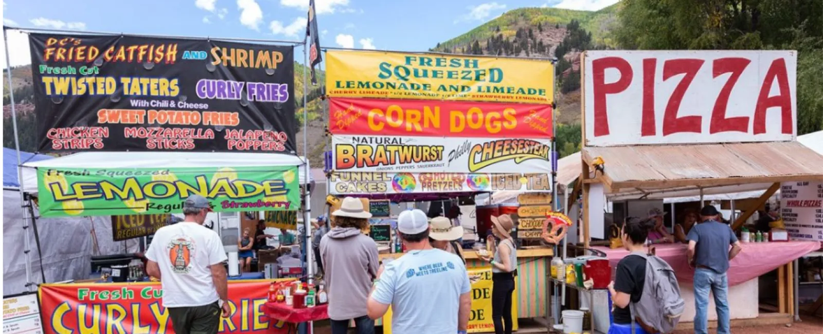
At a huge music festival some years ago I got hungry, so I turned my attention to the food vendors in the distance, a considerable walk from the stage. Not wanting to miss the music, I scanned my list of choices from far away: "PIZZA" one booth had in huge letters. Another had "DUMPLINGS" prominently displayed, Still another had "GYROS", "BURGERS". As I approached I noticed the lines at these booths were super long, and the vendors furiously worked to crank out their food and satisfy a long line of hungry patrons.
Every booth was crowded…except one: "Colorado Bob's homemade world-famous fried chicken skewers". With a hungry crowd in a captured environment, Bob's booth was practically empty.
Was Bob's product bad? Not wanting to wait in a long line, I bought his chicken plate. It was delicious. Bob had a solid product, hot, tasty, and readily available. So why wasn't Bob drawing a crowd like the other booths?
Bob's product wasn't the problem. Bob's communication was. He had a complex logo with lots of cursive text. Maybe fine on a sticker or a business card, but from a distance, you couldn't make out his sign and in a crowded marketplace like that, simplicity wins. Bob wasn't busy so I was able to strike up a conversation. I suggested to him that he was losing sales because people couldn't see what he sells in simple terms and as a result they had already made up their minds on something else before they ever got to him.
It reminded me of how some Local unions promote themselves at career fairs, high schools, and group settings.
Just like a music festival, when people are at a career fair, they are there for a reason. It's crowded, there's limited time, and attendees have scores of other options. The simpler the message the better. Local union logos are notoriously hard to read, particularly from a distance. Generally circular in design with lots of script and obscure icons, and acronyms that few people outside the union community know.
We're not suggesting that you should or even could change the logo design of your local union. Those logos have a storied history and they mean something to your members. What we are suggesting is that in a crowded marketplace, clarity beats clutter.
We've seen locals with booths and tables with the union logo and obscure slogans like "Be Elite" or "The Right Choice", that mean absolutely nothing to those in attendance. Particularly from across the room among people who don't know you. Remember that the attendees are there for their reasons, not yours, so we must speak to them about what's important to them. We must operate on the assumption that they have no idea who we are or what we do.
One great example is when we began marketing ANGBCTC (Atlanta North Georgia Building Trades) as "Georgia Construction Careers". They quickly went from a group of letters few people knew, to a clear, concise, and relevant brand. Instead of spending time and resources to explain something confusing, we changed the message to something anyone can easily read and understand. People immediately know exactly what the brand is about and what's in it for them. And leads went up 3000%.
Oh, and shout out to Colorado Bob. The next year I attended the same festival, I easily spotted Bob's booth from a distance, not by his logo, but by his new banner in big bold red letters: "CHICKEN". And the line was wrapped around the corner.
Speaking of Signs
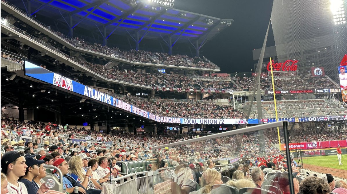
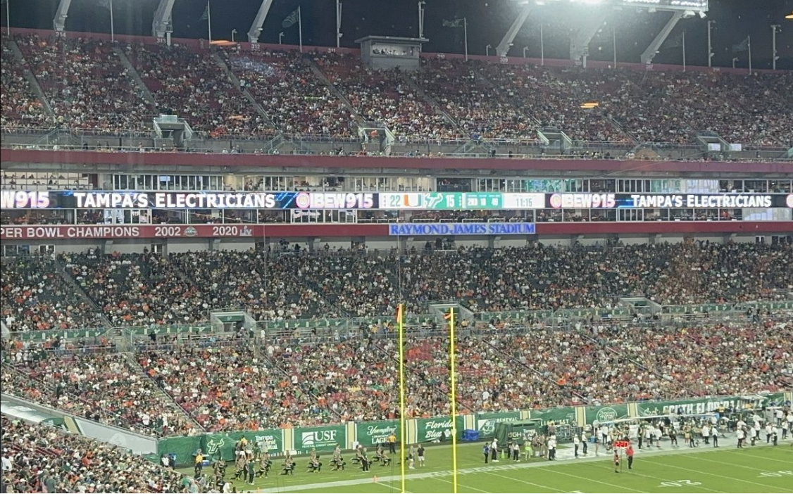
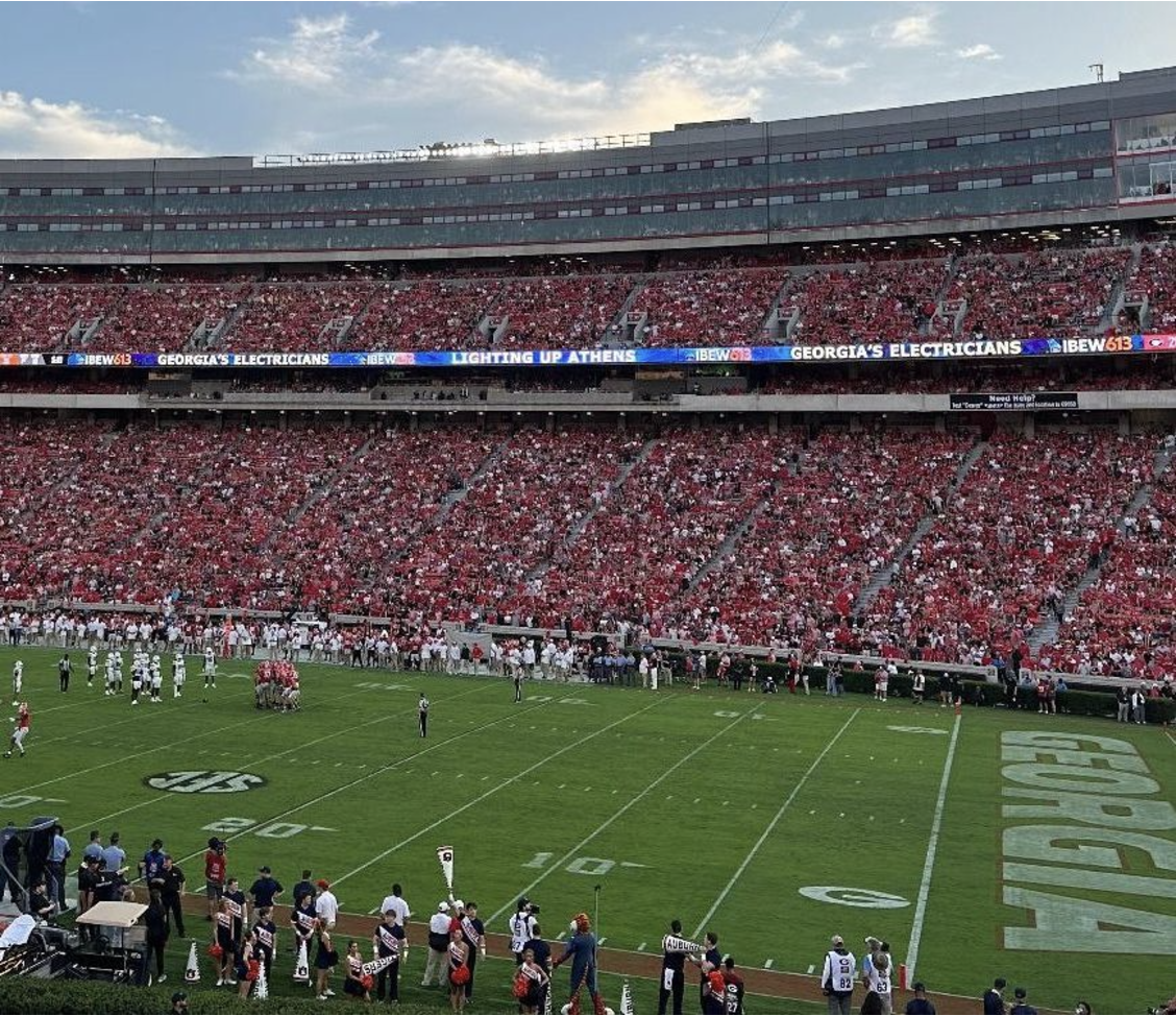
Union Up specializes in making your local union stand out, whether it's in a room at a job fair or in a stadium in front of thousands of people. When Union Up does your graphics, you'll stand out from the crowd with clear communication to those in attendance, so everyone knows who you are and what you do.
